
Tuesday, 6 November 2012


Monday, 5 November 2012
Advert Designs.

Idea 1) Using the idea of the fairy lights having them draped along a fence in the background and then using these lights to highlight the names of the artist and also the name of the album, again using plain portrait images of both artists, so that they look quite calm, cool, collected.

Idea 2) Contrasting to the first a more quirky, simplistic idea, using an image of the two artist drinking tea or alike that something quite urban, and popular to our target audience to make them look new, outrageous, quite quirky. Using the quirky prop as a way of canvasing the artists names on them and then having the writing almost imprinted onto the white background around the artists portrait images.
Photoshoot
We planned out a few sets of photos to be taken and so far we have undergone about 50% of the photo shoot we planned to do simple portrait images of merely 'Ellie Goulding' by herself and then introducing the background artist of 'Calvin Harris' and again doing quite simplistic expressionless images of the two artists to make them look quite edgy, almost completely carefree. And then developing on this further we planned to do outside shots in which entitles the two artists lying head to head, almost puzzled together like they are one person together, and then again having independent images of just the female artist doing an array of quite unique, flamboyant things. One set of photos will entitles the female being covered in quite neon coloured paint making her look quite abstract, colourful, and then as well as this using fairy likes in the dark to light up the artists face and look highlight certain features again make her looks quite unique.
Location Permission Letters.
This is the permission form to film in the borough of Sutton which is needed for the filming within Nonsuch Park, and it will be sent off once we know the exact date and duration of filming.
And secondly this is a permission email which will be sent to Mr Walsh, whom is the head of the drama department, to ask for permission to film in PDH for the rave scene of our music video.
 Finally the last location to be used within our music video is in Dayna's house, which we have been given permission to use by Dayna's parents.
And secondly this is a permission email which will be sent to Mr Walsh, whom is the head of the drama department, to ask for permission to film in PDH for the rave scene of our music video.

CD Cover Design.
This is an image of the completed design for our CD cover for the album as a part of the digi pack we are creating for our chosen artists.

This slide rocket illustrates in greater depth the reason for our choices on the CD cover.
Friday, 26 October 2012
Location Research.

This is the back ground for what will be our paint scene, I feel it will compliment the neon paint well and will create an abstract feel about the scenario.

This is the birds eye view of Greenshaw Wood, which I felt is quite an abstract location and also readily accessible for us when shooting within it for our music video, as well as that it has a large field attached to it, which is the perfect type of location for our scenario within the forest/open field.

Monday, 22 October 2012
Storyboards.
Here is a video of myself ordering the 3 different scenarios we created that would be featuring within our music video for Ellie Goulding and Calvin Harris' 'I Need Your Love'.
Here is a slide rocket showing each of the completed scenarios within our storyboard which will be used to create our animatic.
This is the animatic for our music video.
Here is a slide rocket showing each of the completed scenarios within our storyboard which will be used to create our animatic.
This is the animatic for our music video.
Friday, 19 October 2012


Thursday, 18 October 2012
Concept.
Our concept for our video is quite simple, the concept is merely two people coming together, but the video almost shows some of the small bumps in the road/life trying to keep them apart. We used the main line of the song of 'I need your love' as the main stimulus of our concept, as it is the idea of love basically bringing these two people together, no matter what obstacles they may come to have.
Tuesday, 16 October 2012


Monday, 15 October 2012
.jpeg)
Friday, 12 October 2012
Song Details.
We had to choose between two songs but both were by the artist Calvin Harris as he is a well known Synth Pop artist, the song we eventually chose was I Need Your Love by both himself and Ellie Goulding. As a pair we felt it was the most alike our genre of Synth Pop and as well as that it is a brand new release meaning there is no video made for the song which has made it easy for us to come up with ideas, and as well as this we found this song quite inspiring for ideas for creating a video to the song. As a whole I felt this song is best suited to the genre we are wishing to portray throughout our video and also digi pack.
Thursday, 11 October 2012
Lyrics Annotation.
Here is a gif of the annotated lyrics of our chosen song: Ellie Goulding ft Calvin Harris - I Need Your Love.

picasion gif maker
Tuesday, 9 October 2012

Monday, 8 October 2012
Tuesday, 2 October 2012
Friday, 28 September 2012

Tuesday, 25 September 2012
Audience Research 2.

This horizontal bar graph is one in which I feel has been one of the most helpful responses in our survey, because it gives a clear idea of the kinds of things our audience would like to see on the CD cover as a part of our digi pack, which as a large part of the project, I feel this has given my group a clear idea of what we will include on our CD cover, for example the results state that they would like to see elaborate costumes, and also lots of colour in the cover, which is something we will definitely be taking into consideration, so I found this really helpful responses.

This is another bar chart showing the types of conventions the people answer our survey would associate with our chosen genre of synth pop and alike previous, it showed the clear things that they would and would not want to see, or in this case would think relevant to our genre. From this feedback I can see that they would associate neon colours, glow sticks, disco's and energetic dancing, all things we found from our genre research as well, therefore further strengthening what we had already found out, and alike before has given us a clear idea of the types of things that should be included in our music video or digi pack.

And finally this last question, was the last of the four questions which I felt were most helpful for the creating process of our video and also the digi pack to go alongside it. It shows what our audience likes to do in their free time, and this shows again whether this genre of music will be appropriate to choose when trying to advertise our chosen artist, and it shows how a large amount of them like being out and about, and also partying and being in the midst of the kind of atmosphere you would put with this genre of music, and this I feel alike the previous question, shows the popularity of this genre of music.

Audience research 1.
This is the survey myself and my group members made to get responses from an array of people to find out specifically what they would like to see in a video/digi pack for my chosen genre.
I chose the questions on my survey deliberately because I wanted to first find out a bit about the types of people answering my questionnaire, to get a vague idea who my target audience are from the types of responses they give to the rest of the questions on the survey. Then I slowly built up the questions as to not overwhelm the people answering the questionnaire, and subtly I added in questions in which gave me a clear idea of the types of things they would like to see in a music video and also the other artifacts in my digi pack. For example the question, 'what would you associate with this genre' gave me a clear idea of the things that they identified with this genre so that I can include it in my final products, so that I know the viewer can correctly identify the genre with ease. Developing this further we asked the question 'what do you expect to see on the CD cover of a synth pop artist' to get firstly a clear idea of whether the viewer understands what our genre is and also to find out what they would like to see on the CD cover, and to again use this idea of using things in which they identify with this genre so that we know it will successful in portraying our chosen genre.
I chose the questions on my survey deliberately because I wanted to first find out a bit about the types of people answering my questionnaire, to get a vague idea who my target audience are from the types of responses they give to the rest of the questions on the survey. Then I slowly built up the questions as to not overwhelm the people answering the questionnaire, and subtly I added in questions in which gave me a clear idea of the types of things they would like to see in a music video and also the other artifacts in my digi pack. For example the question, 'what would you associate with this genre' gave me a clear idea of the things that they identified with this genre so that I can include it in my final products, so that I know the viewer can correctly identify the genre with ease. Developing this further we asked the question 'what do you expect to see on the CD cover of a synth pop artist' to get firstly a clear idea of whether the viewer understands what our genre is and also to find out what they would like to see on the CD cover, and to again use this idea of using things in which they identify with this genre so that we know it will successful in portraying our chosen genre.
Friday, 21 September 2012
Advertisement Research.
Poster 1:
 This is an advertisement for a music event in which the band HelloGoodbye played at, and it follows the convention of all of the other 2 advertisement posters I found. For example it has contact/website information to find out more imformation about what it is advertising, it also has the logo for the company which is mainly involved in the creating of the advertising, and in this case it is 'Myspace' and 'VO5'. More importantly fitting with the genre of synth pop, the poster itself, has quite wacky, eccentric, patterns standing out from the background which is a school notepad, suggesting these eccentric shapes are like doodles, suggesting that alike the music video's tends to try and attract its audience, in this case using a well known school symbolisation to attract a teenage audience. And most importantly it has an image of the band itself, with their name so that it is clear who they are, and also that the advertisement purpose is clear, to sell this synth pop band.
Poster 2:
 This poster is a better example of what I am interested in creating myself through a digi pack in the near future. It is advertising this bands new album, and I feel has a much more synth pop feel about it. The back ground is an image of an outdoor location, quite dark, ominous and urban alike those present within the music video's. Also a convention in which is continued from the video's is the neon lights in which are flashing across the page in what looks like quite an energetic fashion, showing the energy within the genre, giving subtle hints of the music within the album, and alike the previous has the name of the band quite predominantly on the poster, but contrastingly does not have the image of the band itself, suggesting their image is not important to them, just the music within the album, and the optimum sales of it. This poster also has some examples of the songs within the album again giving a hint of the music within to intrigued the viewer into buying it. And again alike previous has contact details to give them more information if they need it to pursuade them further, or perhaps give them a link to a webpage, or some other advertising technique which will in fact again make the artist look impressive. It also gives a brief description of what you get alongside the album, or perhaps special freebees, 'CD includes...' to perhaps suggest to the audience that they are getting an impressive deal, which in this economic time, everyone likes to feel like they have saved a large amount of money, suggesting they are trying to attract the audience using any technique they can.
Poster 3:

Record Label Research.
This is a word document I created showing, the main points of three different Record Labels.
Wednesday, 19 September 2012
CD Cover Research.
This is a slideshare showing all three of the CD covers I have analysed for my chosen genre of music, I have analysed three artist's CD covers in which vary greatly, but still fit into this broad, energetic genre.
Genre Research 3.

This is a wordl I created showing the main and also most important conventions for my genre, I also feel that the wordl is a good way of presenting the conventions because it is quite bright and colourful, and certain words stand out from the rest, which I feel is convention in itself of my genre, as there is a continuous feel of uniqueness.
The main conventions of my chosen genre I believe to be very fast paced editing cutting on and off beat of the music, also the use of lighting and special effects is something in which I feel my genre is renowned for. Also the use of abstract costumes and makeup, and again alike previously the idea of standing out and being quite eccentric.
Genre Research 2.
This is a prezi showing an array of video's from artist's from my chosen genre of Synth Pop, I chose carefully an array of artist in which vary across my chosen genre, but all are similar in many ways.
Monday, 17 September 2012
Genre Research 1.
This is a slideshare, showing a mood board I created showing the general image of our chosen genre, and I feel the overall image for the chosen genre is colour.
Artist's from our chosen genre like to be portrayed as unique, individual, to stand out of the crowd, and example of this would be Ellie Goulding, whom has quite a unique look, as she has dyed her hair a pale violet and also has the side of her hair shaved, to make her look edgy, and almost creating her own trend. I believe the artists within this genre are quite rebellious and that is what this music I believe stands for, rebellion and freedom to express yourself.
Artist's from our chosen genre like to be portrayed as unique, individual, to stand out of the crowd, and example of this would be Ellie Goulding, whom has quite a unique look, as she has dyed her hair a pale violet and also has the side of her hair shaved, to make her look edgy, and almost creating her own trend. I believe the artists within this genre are quite rebellious and that is what this music I believe stands for, rebellion and freedom to express yourself.
Tuesday, 11 September 2012
Theories 3 - Andrew Goodwin.
This is a prezi I have created in which highlights the main aims of Goodwin's theory.
Monday, 10 September 2012
Theories 1 - Bordwell and Thompson.
This is a video of myself illistrating the main aim of both Bordwell and Thompson's theory of continuity editing, and then below is a powerpoint presentation going into much more detail about the theory itself.
Sunday, 9 September 2012
Low Budget 2 - 'Just got paid'
The second of the two low budget music video's that I analysed was a pop video, and differs greatly to the 'aha' music video I analysed previously to this one from watching this veideo, it is clear that most aspects differ from the 'aha' video, for example the most obvious aspect would be the lighting, for this video there is continuous hiugh key lighting throughout the video to draw all attention to the boys within it, to almost make them look like 'stars' to suggest they are trying to portray this strerotypical image of boy bands being quite angelic and pristine, this is similar to the video of adam lambert's song, where alike this the lighting is quite high key and pristine, suggesting that this low budget video has greatly followed the conventions of a pop genre video, showing the importance of researching your chosen genre well.
Another convention that I believe they have taken on board well is the locations they have used, similarly to ed sheeran's video I chose to analyse, they used a stage like setting with simple splot light onto the band members to highlight their importance and to also gain portray this angelic, pop star image, similar to the setting used in Sheeran's video. Another aspect of this video in which I believe to follow the pop genre is the use of limited location, alike the others of this genre that I analysed they stick to one or maybe two locations and this one did the exact same as the others. Linking to this the use of sharp, pristin elooking costume again alike adam lambert's video is something in which is a convention of a pop video, caring for their appearance and making sure they look sharp and again back to this 'boy band' image portrayed across the pop genre.
Similar to this the narrative of the video of living this pop star life, going to a party as they have 'just got paid' and singing on a spot lighted stage, again seems to follow the conventions of this genre, but doing it in a simplistic way in which sticks to the low budget nature of these two videos,
Thursday, 6 September 2012
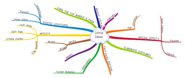
Conventions of a Music Video.
This is a bubbl I created outlining the things I believe to be conventions of a music video, to ensure the successes of a music video.
To sum up the Conventions of a music video, I believe it is split up into four different sections, Location, Narrative, Costume/Props and Lighting.
Location:
To sum up the Conventions of a music video, I believe it is split up into four different sections, Location, Narrative, Costume/Props and Lighting.
Location:
- Appropriate shots to the genre.
- Establishing shots of locations to set a scene.
- Select number of locations, to not over complicate the video itself.
- If appropriate have a story line to the video, portraying a message of the song, e.g broken hearts.
- Relating the lyrics to the action within the shots.
- Balancing between lip sync and not.
- Choose costume appropriate to the location of the video.
- Appropriate to the genre of the song.
- if neccessary props that relate with the location of the shots.
- Not too much going on, to take attention away from the music itself.
- Appropriate to setting.
- used to set the mood of the song, e.g. if sorrowful, quite low key.
- Used to highlight important detail or to high detail.
Low Budget Music Video Ideas.
As the brief of our project is to create our own low budget music video, I watched and analysed closely two music videos of this type, but of two contrasting genre's, as to get a clearer idea of the conventions of a music video of this type, to help make my own work successful and proffessional looking.
The first video of the two is alike the second, of the pop genre, but more specifically synth pop genre. It has quite an abstract feel about the video, and does not have any clear narrative unalike the 'Just got paid' video, in which has a clear story of being paid and going out to enjoy themselves and live their lives to the full.
The video uses imnages in which illustrate the lyrics themselves, to create continuituity that way, to replace the idea of location as this video does not give any clear establishing shots of location or setting of the video, again very contrasting to the other video in which I analysed. Again alike the location there were no clear shots of costume shown as each of the shots were made to show snippets of information to keep the viewer intrugued to find out about the obscure character whom is concieled through editting techniques. But we did get a few snippets of dark makeup around the figures eyes to make them look ominous and quite dark, contrasting to the angelic nature created in the 'Just Got Paid' video, in which was very pure and bright. Linking to this the lighting of the shots are quite dark and use a lot of low keylighting, and also artificial lighting through the use of editing to make this video look quite as abstract as it does, but overall I feel it is a really successful video, as their chosen genre is reknowned for being quite abstract and unique compared to general pop videos.
Tuesday, 17 July 2012
Pop Genre 3 - Ed Sheeran - You Need Me, I Don't Need You.
This video I found to be quite contraversial in the genre it would fit into, ads it holds conventions of both the individual genres, but is still quite dominantly a pop genre music video.
The lighting, alike the low budget video I analysed previously has a high key spot light, with a low key background to make the main, centre focus stand out from the back drop. As this song is quite gentle and slow opaced, the low key lighting sets quite an ambient mood in which relates well with the song itself, again linking to the sense that each music viideo uses each conventonal relevantly.
Similarly to this slow paced music, the editting is quite slow paced, merely cutting from shot to shot at a steady pace, and linking well with this the shots do not vary dramatically, keeping a steady, ambient mood about the video. Again linking to this further the general mise en scene of the video is quite ambient, and almost mundane, as it is all quite neutral shades of greys including the peoples clothing and general persona by the placement in dead centre of the screen. is quite simplistic yet fits with the song itself.
Pop Genre 2 - Adam Lambert - Never Close Our Eyes

This shows an array of shots from the music video for this song, and they show how similar to the other pop genre videos consists of a large amount of high key lighting, making the space look open and almost quite welcoming. Throughout researching and analysing this genre of music, I have found quite continous conventions, and this video does not fail to follow similar patterns to the other two videos of this genre in whihch I have chosen, and this has helped me get a cleaerer insight into the kinds of patterns music videos follow.
For examples there is a large amount of extreme close up/close up shots to shield information in which has been present in each other video also, as well as this the pace of the editting itself its quite fast paced as it links well with the pace of the song itself again alike the others of this genre.
Rock Genre 3 - Sleeping with Sirens.
This is an annotated video of the music video for this song highlighting aspects of costume, location, camera shots/angles and narrative.
Rock Genre 2 - Young Guns - Bones.


 Also these snippets show the type of costume present in this rock genre of music, showing snippets of ripped jeans, dark coloured clothing, lots of black. As well as showing a snippet of the costume, it also show snippets of the location, as being dirty, rundown, almost an ominous atmosphere, relating well to the style of music playing along side these string of shots.

 There are two locations present in this video, it shows a run down urban looking location, with a new female character introduced, again alike the other figures present, wearing very dark, black clothing, and again in silhouette due to the natural lighting used to again shield the identity of the figure, to create curiosity and mystery about the video.
Rock Genre 1 - Architects - These Colours don't Run.
This rock genre video is one of my faouvrite video's out of my 3 chosen from this genre, as unlike most music videos, it does not follow any form of narrative it is merely a lyric video strung together cleverly with images that link with the lyrics of the song, and also each image is used to impact the viewer, and I feel it has been done very successfully even without the use of narrative.
For example when the wo the line with streets paved with gold occurs in the song, and also it is a main line of the song within the chorus, an image of a busy, crowded looking street appears, but also the shot uses editting techniques to put the small snippet of the street in fast pace to make it almsot blur and blend across the screen, fitting well with the fast paced-ness of the song itself.
This vide I feel is a primise example of the importance of videos using images and also editting to go with the gnere of the song and also the pace of the song, to make sure it is all used appropriately. As the editting of the individual shots, is very fast and each image cuts sharply from one to the next and as the genre of this song is known to be almost sharp sounding, this type of editting is perfect for it.
Brief.
A promotion package for the release of an album, to include a music promo video, together with two of the following three options:
Here is a video of myself giving a clearer idea of what the brief is for this project.
- A website homepage for the band
- A digipak for the album's release
- A magazine advertisement for the digipak
Here is a video of myself giving a clearer idea of what the brief is for this project.
Monday, 16 July 2012
In the Sun Remake - Reflection.
What did you do when filming that made the video professional?
- When filming, the entire class listened well to myself and Dayna, who took on the role of Production Managers, and I felt we continuously reflected back to our detailed storyboards we drew up so that we knew what actor was in the shot, and what crew was needed in filming the shot.
- Secondly I felt the communication between all group members helped make the piece look proffessional as every person contributed their idea's into making the filming run as smoothly as possible.
- I took responsibility for the probs I was meant to bring and also my own individual shots to film, and made sure all of the props were used appropriately throughout.
- Finally I felt, even though I struggled with the choreography aspect of the piece, I was persistant throughout.
- I felt at times we lost motivation and that slightly wasted the time limit we were working under, but that was a very small percentage of the time in comparison to the whole usage of our time.
- unfocussed at times.
- Overall product looks proffessional.
- every class member took part, and have a part of the sequence that they can specifically identify as their own work,
- we all had the opportunity to try out the different roles needed to make a successful video.
- I felt being given the role of the production manager gave me a sense of responsibility, and I feel this has personally helped me take charge of a group successfully.
- Been much more focussed throughout the whole duration of filming.
- faster paced when filming each of the shots.
- perhaps put more effort into all of the choreography to make the overall product look slightly more polished.
- Not focussed on making the video look exactly the same as the exampler video, and focussed more on making it look proffessional and polished.
Tuesday, 19 June 2012
Tuesday, 12 June 2012
Lip Sync Practice 1 - Tik Tok - Kesha.
Improvements:
- Have the actors doing more movements/hand gestures to make the shots more interesting.
- Have actors using more facial expressions to look like they are enjoying themselves more, looks like emotionless and forced.
- Frame shots more similarly.
What went well:
- We were successful with our lip syncing, as it was all on time with the track and also with each other.
Subscribe to:
Comments (Atom)